The goal
To provide a searchable index of dishes to collate and curate into weekly sharable menus, based on dietary restrictions, nutritional goals, regional availability of ingredients. The platform would have a strong social aspect in a similar way to Pinterest to help with uptake.
My role
I’d been tasked with the development of the UX mainly but discussions would often ideas for experience enhancement and scope development, I was also responsible for all front-end development on WordPress and the style guidelines.
Discovery
Joice was the brain-child of the project owner Susanna, who had a clear idea of what she thought the service should do. So, we started with her idea and by carding the elements of the project to start to outline base requirements to establish a basic user flow.
We had our default user in mind who by sheer coincidence was very similar to the project’s owner Suzanna. We knew this wasn’t ideal but it would provide us with enough to get a model together.
However, there were enough points outlined to be able to split the requirements into different personas for describing a user-journey with different demands for the system to serve.
UX
Using a combination of Heuristic design, User stories and user-flow we honed the basic requirements of the service.
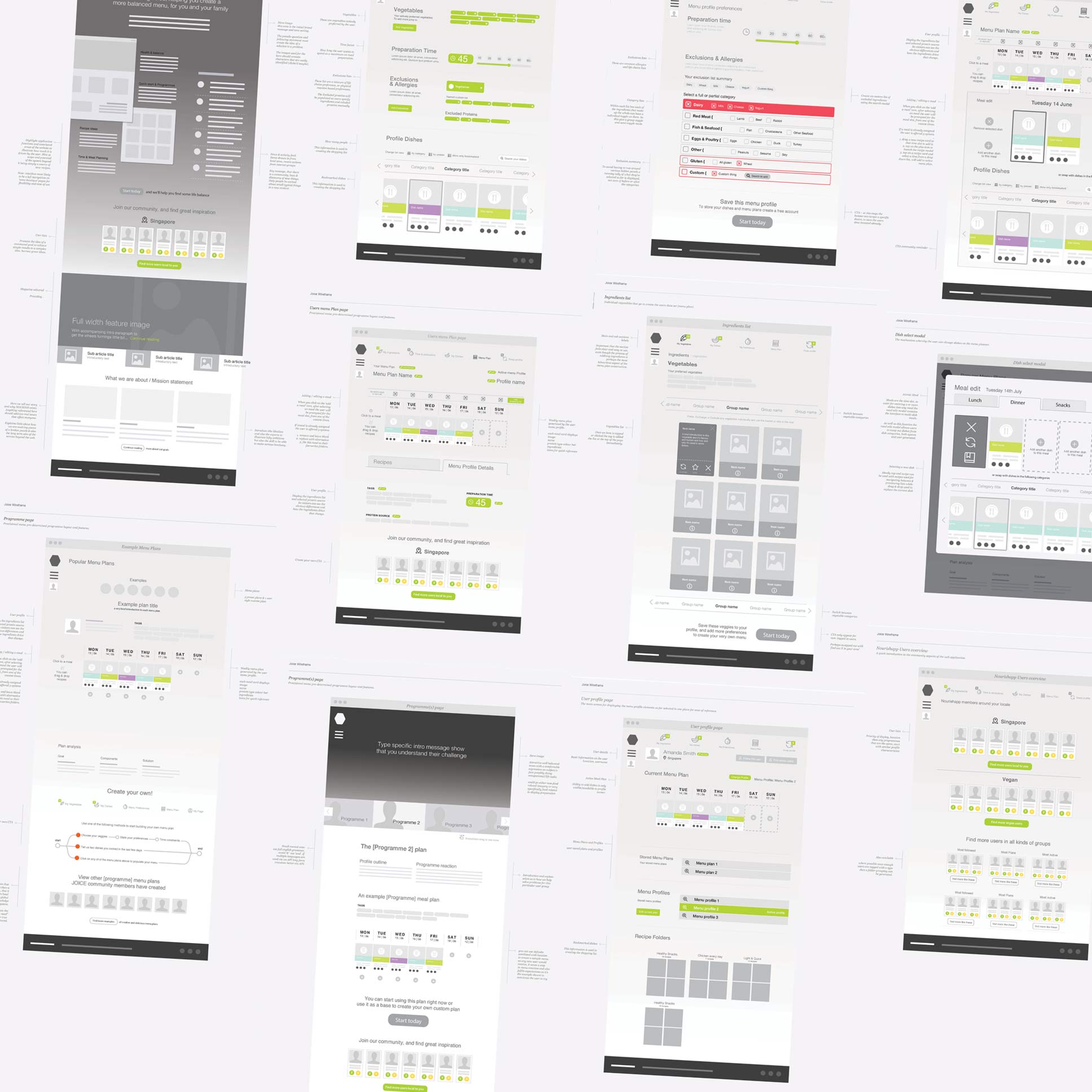
From these outlines, lo-res mockups were created to solidify the ideas and provide the team with a single point (InVision) of reference for discussions to progress. While applying design thinking to the service design to ensure the elements were not only in place but timely and useable.
Challenges
Membership
How to make people invest in the service?
insight
Utility and ease-of-use – and free to use.
Get people using the service so they can see how it might provide value, but requiring users to create an account to store all menus created. Means there’s a strong incentive to subscribe to the service.
Value
How were we going to differentiate our service from existing meal archive websites?
insight
Built into the core of our service was ‘the desire to eat better’ – as an individual or as a family. Our meals would all contain nutritional data alongside calories to make sure your weeks nutrition goals would be met.
Community
How to plug into our desire to share good things with friends?
insight
By making the creation of an account facebook login (or email) we could gain access to an existing social network and sharing platform. It was important users should be able to share their weekly menus online.
Mystery tour
How would users start using the service as it was intended?
insight
In the process of account creation the process would be broken into steps, each one asking a element of the data used to present a suggested plan their upcoming week.
in addition to this we had landing pages giving an overview of the service features.
Finance
How would the service maintain viability?
insight
We wanted to use paid partnerships with businesses supermarkets and grocers local to the users. Part of the Joice service was a dynamic shopping list generator, and partners would be listed as locations to buy ingredients to cook each weeks menu.
UI
There were three main aspects to the design of the Service;
- The marketing and landing pages.
- the meal library and menu calendar.
- The social and sharing aspects.
Prototypes
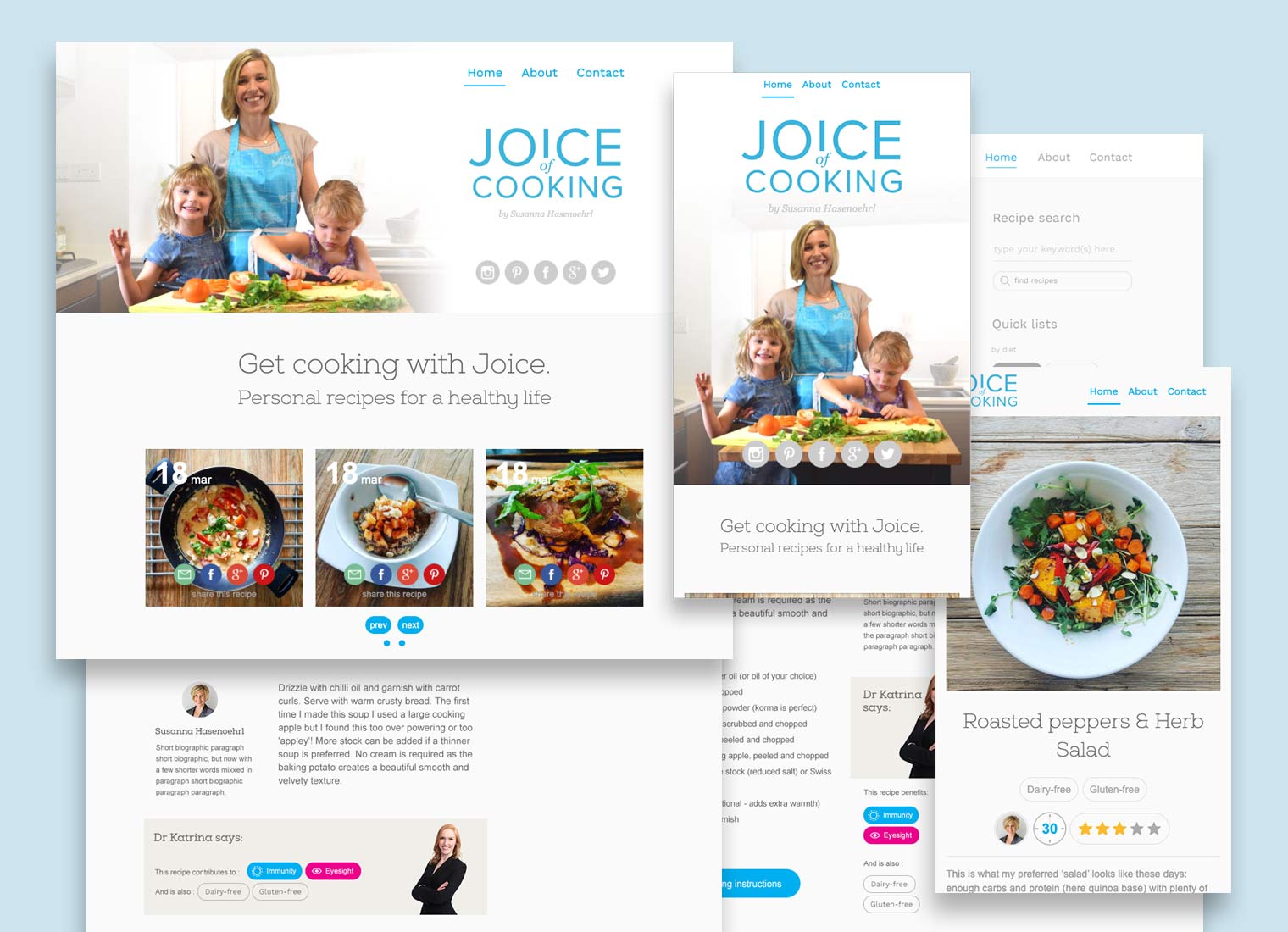
A very early page design made digital flesh, I’d produced a couple of static HTML pages to test out the responsive layout and fonts, etc, and injected some filler text to get an idea of the flow of the page.
First build
I took the html pages and created a model of the service built on WordPress, It was used to validate the interactive elements. We also used this site to hone the API to make sure required information was being requested as needed. We already had been generating our recipe database to test the build. Our team’s Web developer had built our Data architecture and infrastructure to support the bulk of the data and its retrieval.
Mobile first
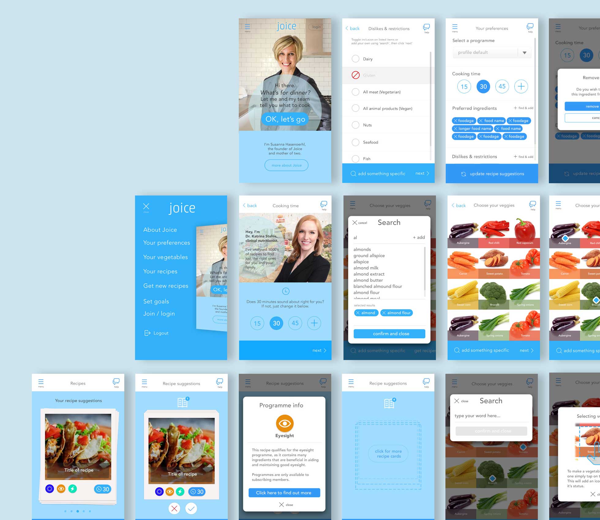
A large chunk of the UI work was taking the screens we had created for tablet devices and making sure that the content fit onto a mobile without it being compromised.
Testing
Throughout the development of the project, each major interactive iteration would be tested by a focus group (6-10) for validation and feedback received would be reviewed to be included in the next iteration.
The hand-off
A Singapore based web publisher was approached to provide the App version of the service using the database we had created and the Joice engine and API.
Epilogue
Based on the Beta version, enough excitement about its potential convinced local organic supermarket to request a branded version for mobile. A sort of dynamically generated ingredients list restricted by ingredients available in their store. So you’d be able to cook any of the recipes the engine suggested.
