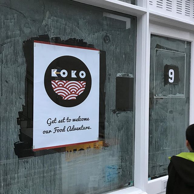
Branding
Once the name and style of food were agreed upon I was tasked with among other tasks the branding of the establishment. From the phonics (max two syllables) of the name to the contemporary/clean look of the decor, many aspects of the theme were hammered out by the small team of 2+2 (2 partners and 2 partner’s partners).
The logo
The initial design was based around the text treatment I had proposed – with my wife adding the bowl as both Poké-don and donburi as rice in a bowl dishes.
I wanted the design to fit into a circle well so I shortened the height of the bowl (as I always try to fit a design into a circle or square if possible). I also wanted to lose the hard edge of the bowl and while I was at it provide a hint as to the cuisine type with the traditional Japanese pattern.
The final design incorporated what we called the ‘chopsticks’ motif into the top of each of the K’s of KOKO, as it was felt that the stark outline of the letterforms was a little too harsh. It was a last-minute suggestion from my son (I think).
Once all the elements were together the spacing out was done to give the overall design clarity and breathing room.
logo evolution
final design
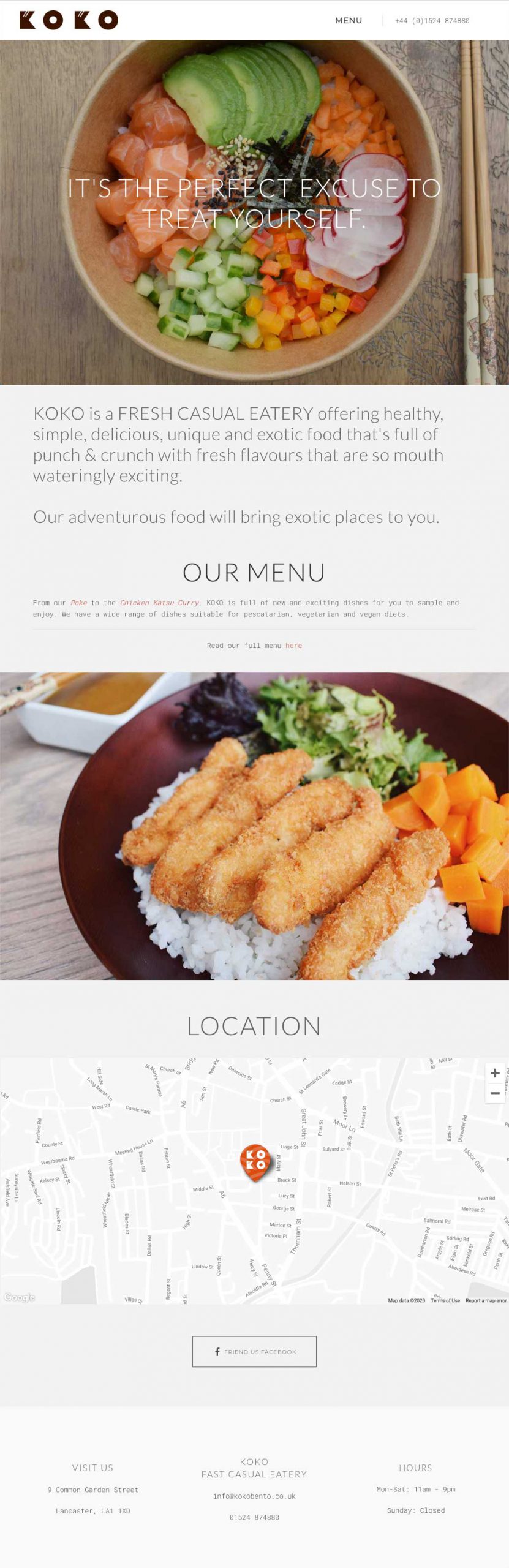
Website
A simple 3 page website to point any social media posts at, and get you listed in google maps so you in local searches. In the end online ordering was handled by third-party platforms like JustEat as their reach is simply enormous.
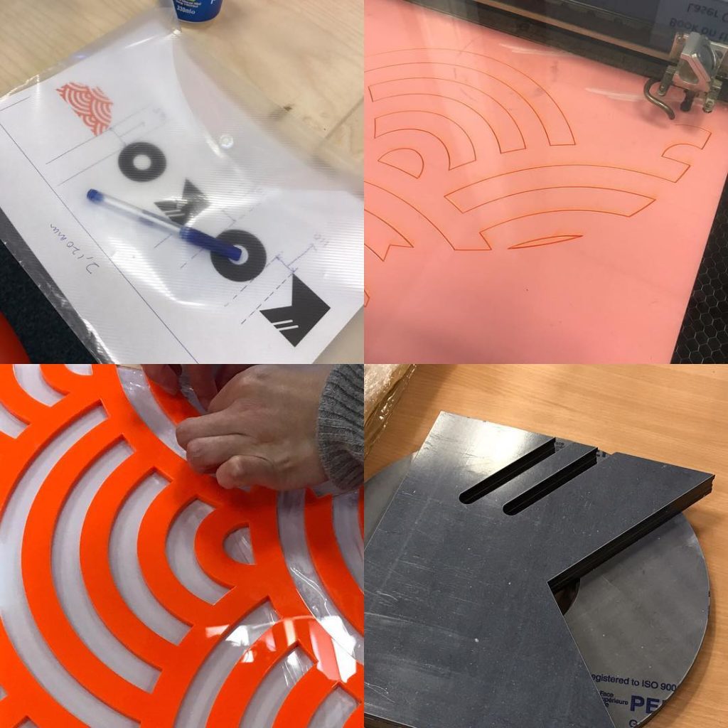
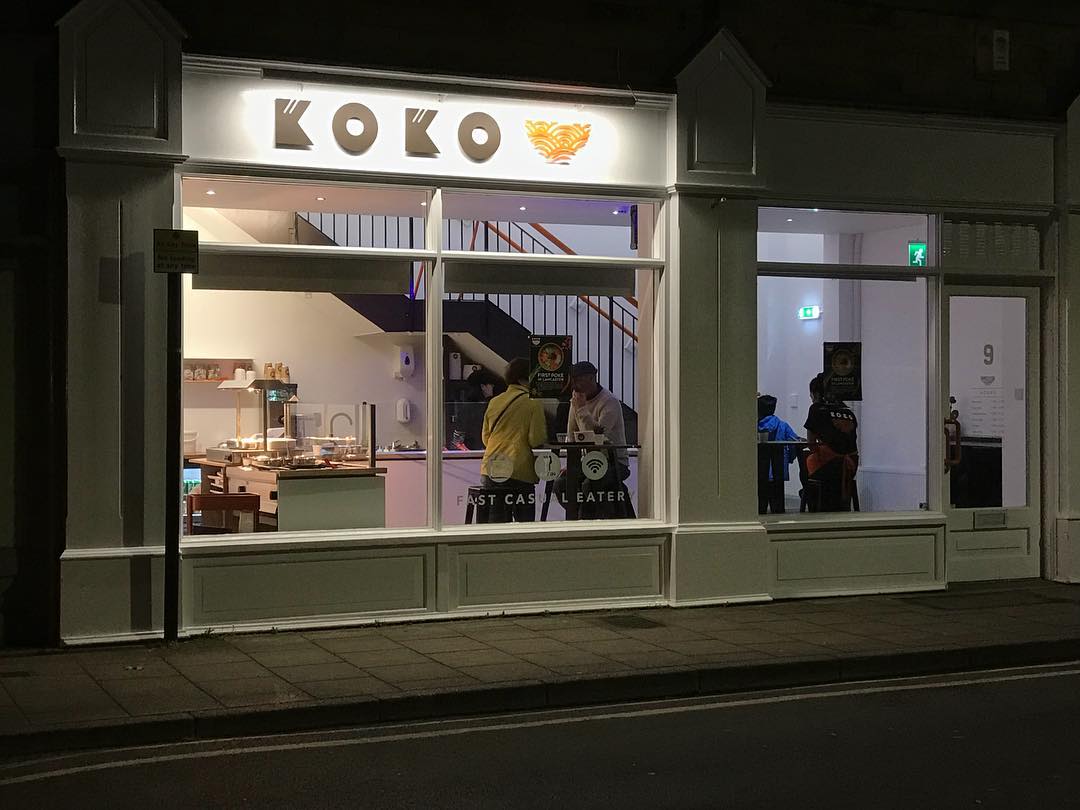
Signage
Another first for me, I have designed signage a few times but I’ve never been the person to affix it to the actual buildings.
I used a Fab Lab to cut acrylic sheets to fabricate the store’s signage elements, great fun to see a physical object appear from a vector file.
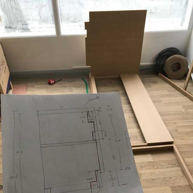
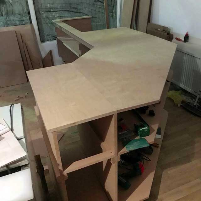
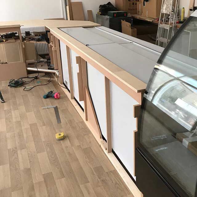
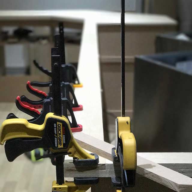
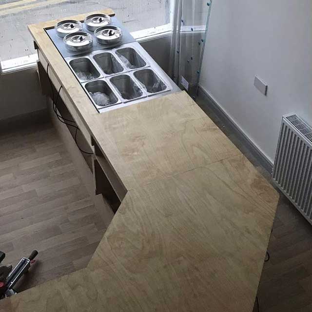
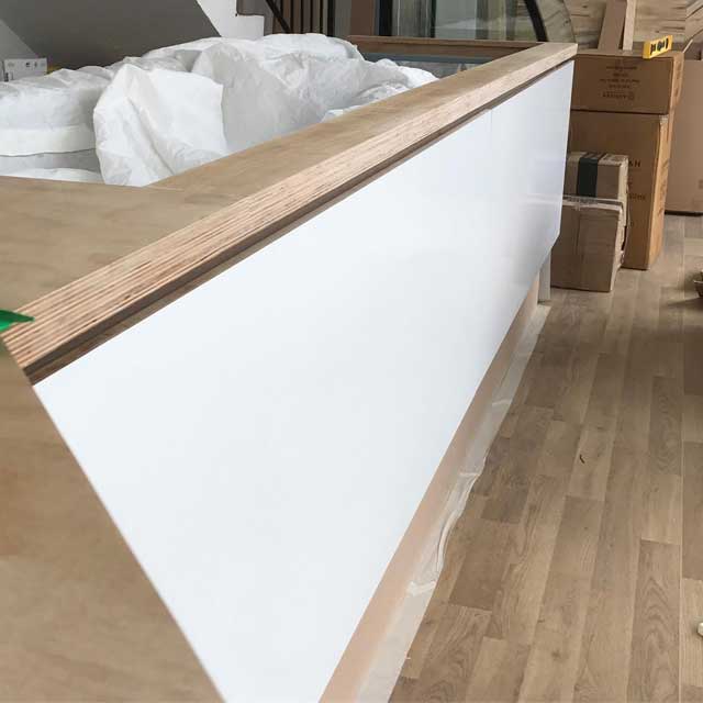
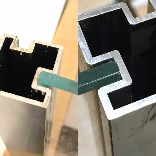
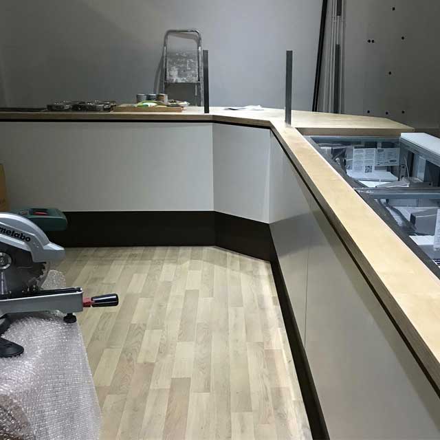
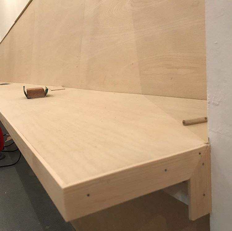
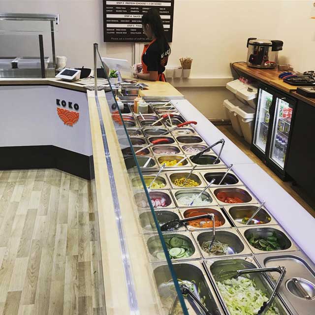
The Fit-out
In an attempt to keep the budget down I offered to build the shop counter, which I designed to incorporate the chill units and other serving equipment. I hadn’t built one before – but I’ve worked in a carpentry workshop previously, so it wasn’t too daunting a task.
I also undertook various elements of the fit-out like the 6.7 metre ash veneered bench in the seating area upstairs.