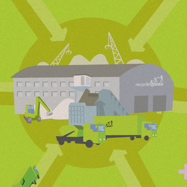
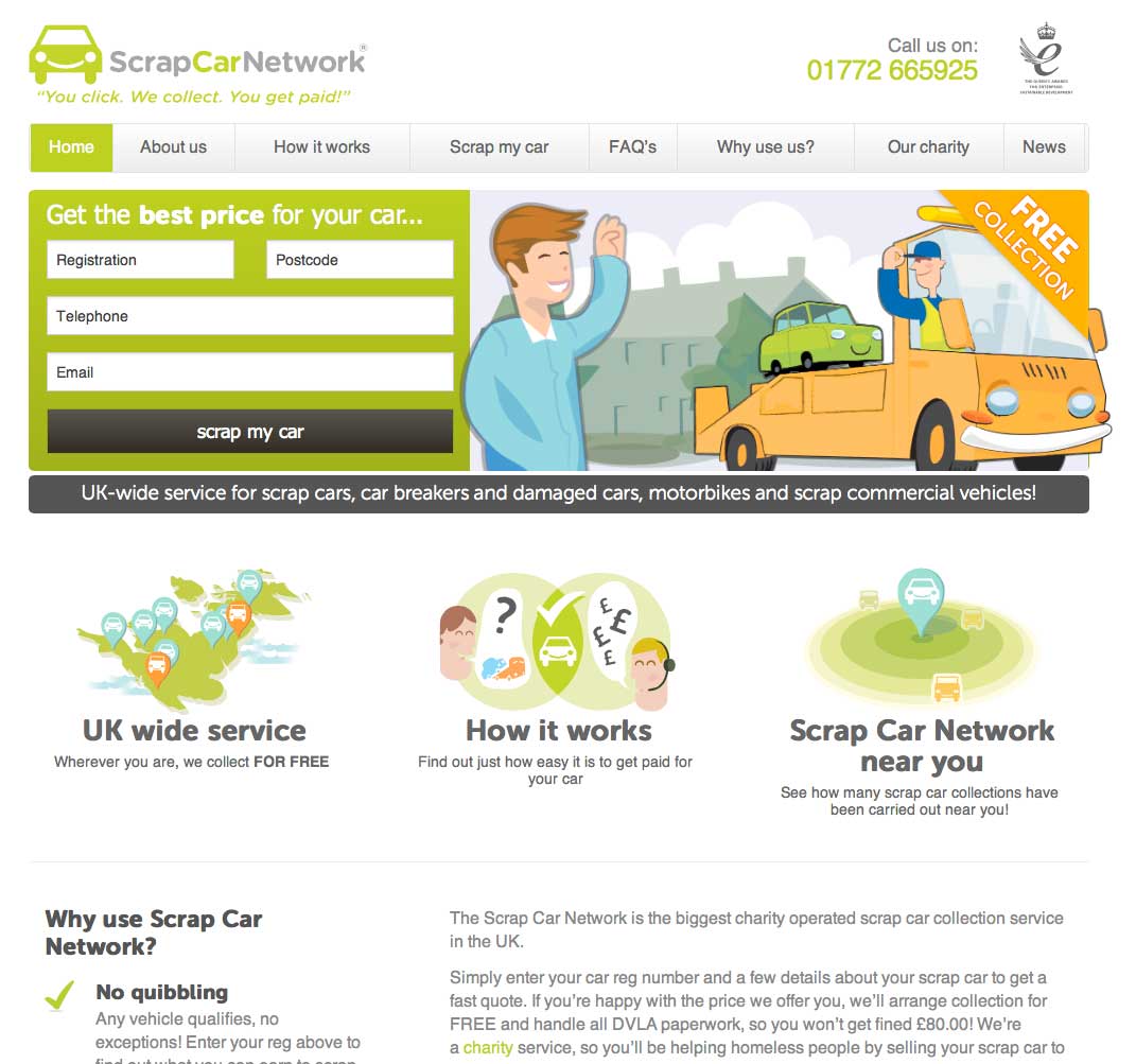
The website
The design of the website was reflected throughout the comms of the service with everything branded up uniformly, so while the style was less than formal – the uniformity of the branding showed it was as professional as any around.
There were also CTA specific landing pages for specific email and social media campaigns. To help send the message that you might be able to benefit from scrapping your vehicle rather than throw money into a hole.
Illustrations
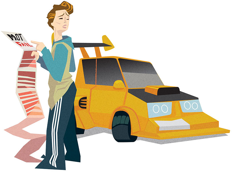
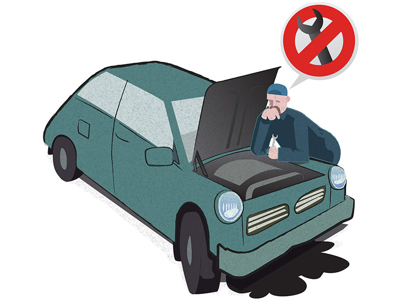
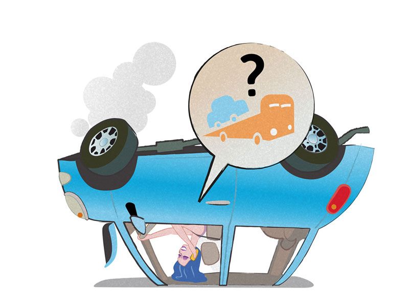
Throughout the project i’d try to make the look and feel of the design quite light hearted. This was carried through to all correspondence to try and make the experience of interacting with the service memorable.
Landing page images
Always slightly over-the-top but still relatable accompanying images.
